
环信IM即时通讯 - 小程序模版使用指南
文档简介:
此模版根据 uni-app 版本的小程序进行2次封装而来,组件可灵活抽离且可以快速集成在其他项目中。不用过分关注收发消息、发图片、发文件、消息上屏等逻辑。从而快速集成符合自身业务的功能。


此模版根据 uni-app 版本的小程序进行2次封装而来,组件可灵活抽离且可以快速集成在其他项目中。不用过分关注收发消息、发图片、发文件、消息上屏等逻辑。从而快速集成符合自身业务的功能
简介
小程序模版源码地址 (注意:分支为:versions2.0)
- https://github.com/easemob/webim-uniapp-demo/tree/versions2.0(opens new window)
安装scss/sass依赖
HBuilderx ⇒ 工具 ⇒ 插件安装 ⇒ 安装新插件 ⇒ 前往插件市场安装
- 地址:https://ext.dcloud.net.cn/plugin?id=2046(opens new window)
集成说明
注意
小程序模版必须依赖环信 IM SDK,因而在使用小程序模版时必须同时添加环信 IM SDK 依赖。
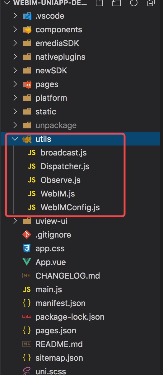
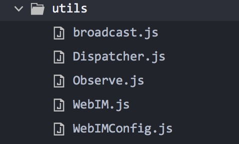
所有依赖配置项都在 utils 中:
具体 SDK 集成,详见 Uniapp 全平台
快速使用
小程序模版封装了常用 IM 功能,提供了会话,聊天及联系人等基本的 component,旨在帮助开发者快速集成环信 SDK。 同时也集成了第三方 UI 库(Uview-ui),且可按需引入。UI 库详情:https://www.uviewui.com/components/intro.html(opens new window)
组件介绍
组件使用
import chat from "@/components/chat/chat.vue"; // chatType=singleChat 单聊 <chat :username="username"
// 必填 ref="chat" // 必填 chatType="singleChat"> // 必填 </chat> // chatType=chatRoom 群聊 <chat
     ref="chat" // 必填 :username="username" // 必填 chatType="chatRoom" // 必填 </chat>
chat 组件详细介绍
参数介绍
- username – 必传参数 由消息列表或联系人通过 URL 传入,包含当前用户 name 以及当前点击用户 name;示例:username: “{“myName”:“xx”,”your“:“xxx”}”
- chatType – 必传参数 聊天类型singleChat:单聊 chatRoom:群聊 可自定新增
chat 组件依赖
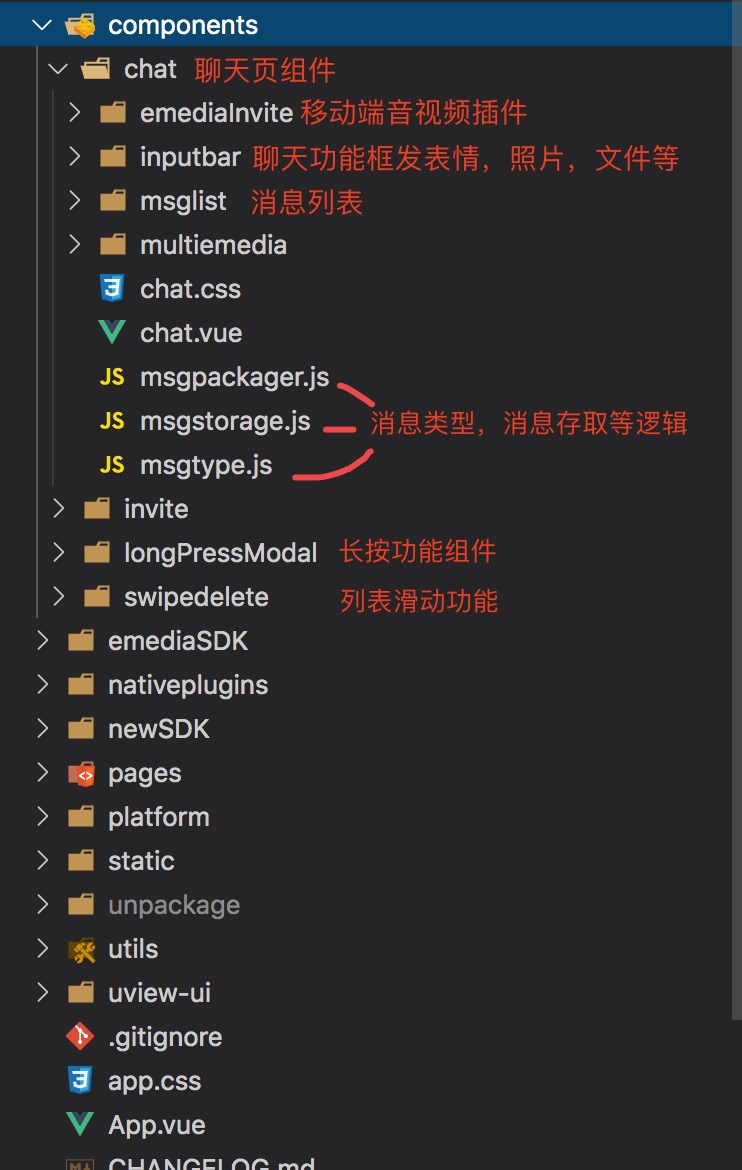
- chat 组件依赖 utils 中的文件,因此使用 chat 组件时,务必保证 utils 中的文件一并存在
 chat 组件的消息存取
- 所有消息都存在了各端小程序的 Storage 中,在 component/chat/msgtype.js 文件中定义消息类型,消息的逻辑处理在 component/chat/msgstorage.js 中,处理完各种消息类型并调用 uni.setStorage() 将消息存在本地,页面中通过 uni.getStorageSync() 获取消息
组件可根据自身需求随意调整样式,详细请看 component/chat/chat.vue
滑动组件
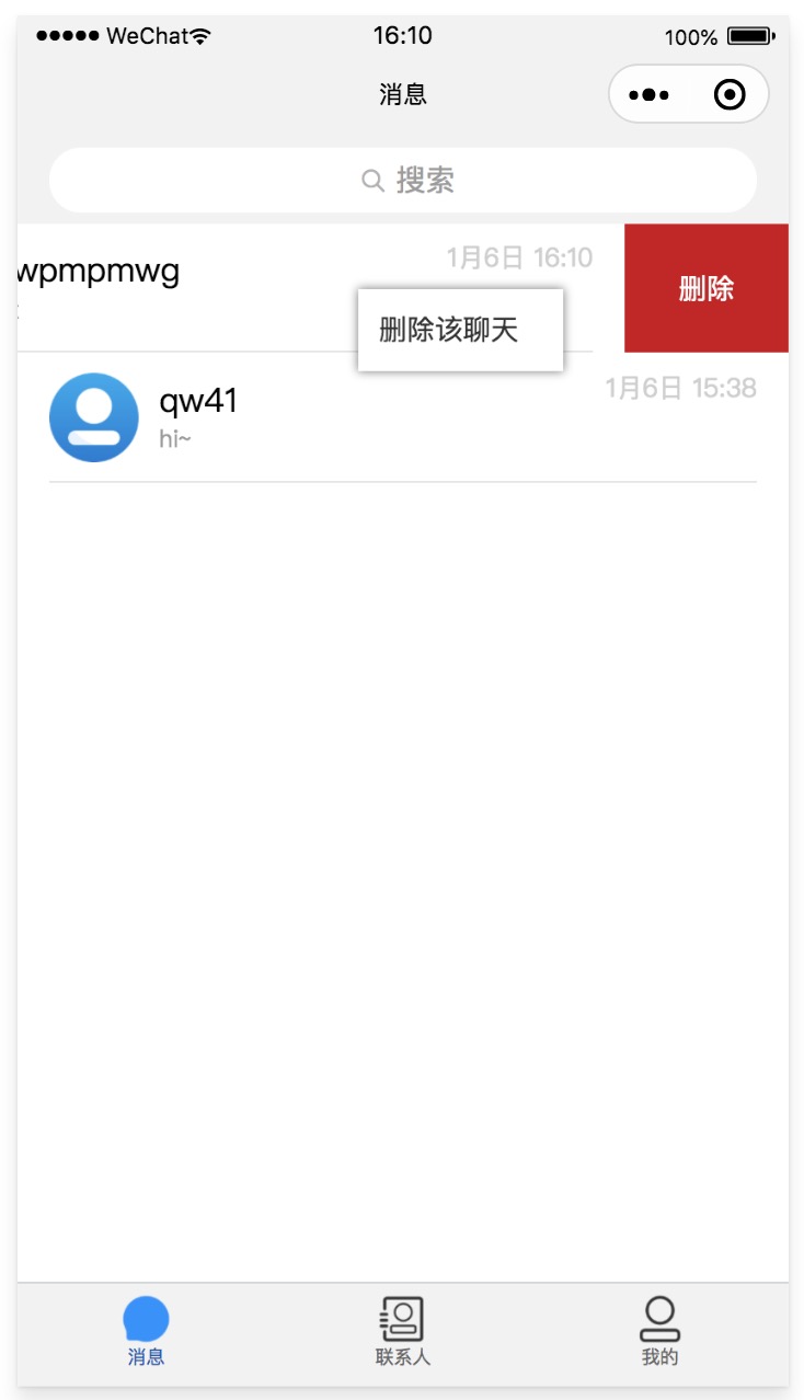
import swipeDelete from "@/components/swipedelete/swipedelete"; <swipe-delete> ... </swipe-delete>
长按功能框
import longPressModal from "@/components/longPressModal/index"; <long-press-modal :winSize="winSize"
// 当前窗口高宽 :popButton="popButton" // ['删除该聊天','置顶','自定义'] @change="pickerMenuChange"
// 当前选中的参数 :showPop="showPop" // 遮罩 @hidePop="hidePop" // 显隐功能框 :popStyle="popStyle"/> // 样式
 长按组件详细介绍
参数介绍
长按组件参数
- winSize – 必传参数 Objet,示例:winSize:{witdh: windowWidth, height: windowHeight}
- popButton – 必传参数 Array,示例:['删除该聊天','置顶','自定义']
- change – Function ,当前选中的具体参数
- showPop – 必传参数 Bool,遮罩默认 false
- hidePop – Function,显隐框操作事件
- popStyle – string,样式
注意
使用长按组件时候需要先获取当前窗口,再根据当前点击的位置来显示组件框:
onLoad(){ /* 获取窗口尺寸 */ uni.getSystemInfo({ success: (res) => { this.winSize = { witdh: res.windowWidth,
height: res.windowHeight, }; }, }); } /* 长按事件 */ longpress: function (e) { //将当前选中的值存在data中方便后续操作
this.currentVal = e let [touches, style, index] = [e.touches[0],"",e.currentTarget.dataset.index,]; /* 因 非H5端不兼容
style 属性绑定 Object ,所以拼接字符 */ if (touches.clientY > this.winSize.height / 2) { style = `bottom:$
{this.winSize.height - touches.clientY}px;`; } else { style = `top:${touches.clientY}px;`; } if (touches.clientX >
this.winSize.witdh / 2) { style += `right:${this.winSize.witdh - touches.clientX}px`; } else
style += `left:${touches.clientX}px`; } this.popStyle = style; this.$nextTick(() => { setTimeout(() =>
{ this.showPop = true; }, 10); }); },